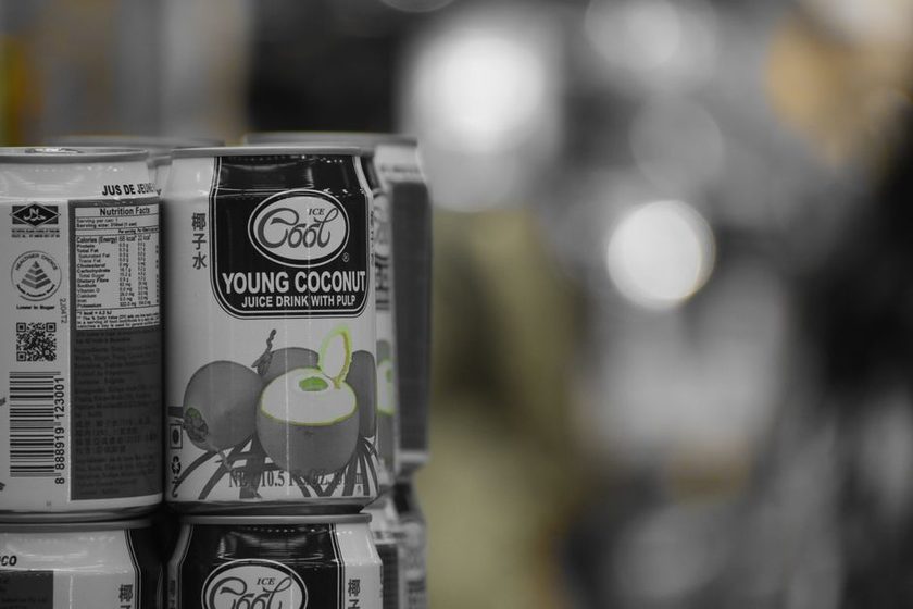
The panel on the back of a package is one of the few pieces of writing in a grocery store that is not trying to persuade anyone. The front is advertising. The back is a disclosure document, written to a format set by regulation, and it is comparatively honest. Most of the anxiety it produces comes not from what it says but from three or four small conventions that nobody explains — the serving line, the ordering of ingredients, the percentages down the right-hand side, and the long chemical names near the bottom. Each has a plain explanation.
The serving size is a measurement, not a suggestion
This is the single most common misreading, and it is easy to see why. The serving size looks like advice. It reads as though a committee has decided how much a reasonable person ought to eat. It has done nothing of the kind.
Serving sizes exist so that two products can be compared on the same scale. They are meant to reflect what people typically consume in one sitting — determined by consumption survey data, not by aspiration — precisely so that one brand of cereal cannot make itself look virtuous by declaring a smaller spoonful than its competitor. When U.S. labels were overhauled and the new format phased in around 2020, several reference amounts were revised upward to match what people actually eat, calories were printed larger, and an "added sugars" line was introduced.
The number that still catches everyone is servings per container. A bottle holding two and a half servings displays a per-serving figure that has to be multiplied by two and a half if the bottle is finished. The rules now require some packages in that awkward middle range to carry two columns — per serving and per package — which removes the arithmetic. On older or smaller packages, the arithmetic remains the reader's job.
Ingredients are ranked by weight, which cuts both ways
Ingredients appear in descending order by weight at the time of manufacture. It is a genuinely useful rule and it has two well-known blind spots.
The first is water. In a soup or a sauce, water is heavy and lands near the top, which tells a reader very little. The second is more interesting: an ingredient can be split. If a product contains cane sugar, corn syrup, honey, and molasses, each is weighed separately, and each can sit modestly in the middle of the list even though their combined weight would put sugar first. Nothing about this is illegal or hidden; it is a straightforward consequence of ranking by individual ingredient. The added-sugars line on the panel exists partly because the ingredient list alone made this hard to see.
An ingredient list answers the question "what is in here, roughly in what order?" — it was never designed to answer "how much of it, and does that matter?"
%DV is a benchmark borrowed from a hypothetical person
The percentages along the right are Percent Daily Values, and they are calculated against a 2,000-calorie reference diet. That figure is a labeling convention, not a prescription. It exists because a percentage needs a denominator, and a shared denominator is what makes labels comparable across products.
Read that way, the column becomes much less intimidating. The rough guide used by nutrition educators is that 5% or less of a Daily Value counts as low and 20% or more counts as high, for a single serving. Whether high is welcome depends entirely on the nutrient. A high percentage of fiber, potassium, calcium, or vitamin D is generally something people are trying to accumulate over a day. A high percentage of sodium, saturated fat, or added sugars is something most guidance suggests keeping an eye on. The panel does not distinguish between the two; it simply reports.
Long names are not a threat level
The rule that circulates online is: if you cannot pronounce it, do not eat it. As a heuristic it tracks one thing well — familiarity — and one thing not at all, which is risk.
Chemical nomenclature is descriptive. It is built to identify a molecule unambiguously, and molecules do not have short names simply because they are harmless. A few of the usual suspects on an ingredient list:
- Ascorbic acid — vitamin C, frequently added as an antioxidant to keep color and fat from turning.
- Tocopherols — vitamin E compounds, used the same way.
- Thiamine mononitrate, riboflavin, niacin, pyridoxine hydrochloride, cyanocobalamin — B vitamins, usually present because a flour was enriched.
- Xanthan gum — a thickener produced by bacterial fermentation of sugar.
- Citric acid — the same acid as in a lemon, generally produced by fermentation at scale.
Meanwhile, "sugar" is one syllable, and nobody has ever needed a dictionary for "salt." The pronunciation test would clear both and flag vitamin E. That is a fairly complete demonstration of what the test measures. It is the same instinct that gives the word "toxin" its power in marketing, discussed in what the word "detox" actually means.
Claims, and what holds up
| The familiar claim | What's actually supported |
|---|---|
| The serving size is how much you should eat | It's a comparison unit based on typical consumption data — not a recommendation |
| The first ingredient tells you what the product mostly is | Roughly, by weight — but water ranks high in wet foods and split sweeteners each rank lower |
| %DV shows what a person needs | It's a percentage of a 2,000-calorie reference diet, used so products can be compared |
| Unpronounceable ingredients are the dangerous ones | Name length reflects chemical naming conventions; several long names are ordinary vitamins |
| Front-of-pack claims summarize the panel | Front claims are marketing copy; the regulated disclosure is on the back |
What the panel is good for
Used as intended, the label is a comparison tool. Set two similar products side by side, check that the serving sizes match before comparing anything else, and look at the handful of lines that are actually different. Used as a verdict machine — good food, bad food, safe ingredient, scary ingredient — it will disappoint, because it was never built to render verdicts. It reports composition, which is a smaller and far more reliable job than the one it is usually assigned, and a good deal more reliable than the transformation narratives examined in the trouble with before-and-after stories.